Marshall B. Ketchum University Brand Guidelines
JANUARY 2019 – PROJECT ROLE
Provided art direction and graphic design; Delivered printed Booklets; Brand Toolkit; Posters; Presentation
Challenge
MBKU was seeking to refresh of its brand identity in order to refine the printing quality of its assets and update its guidelines.
Background
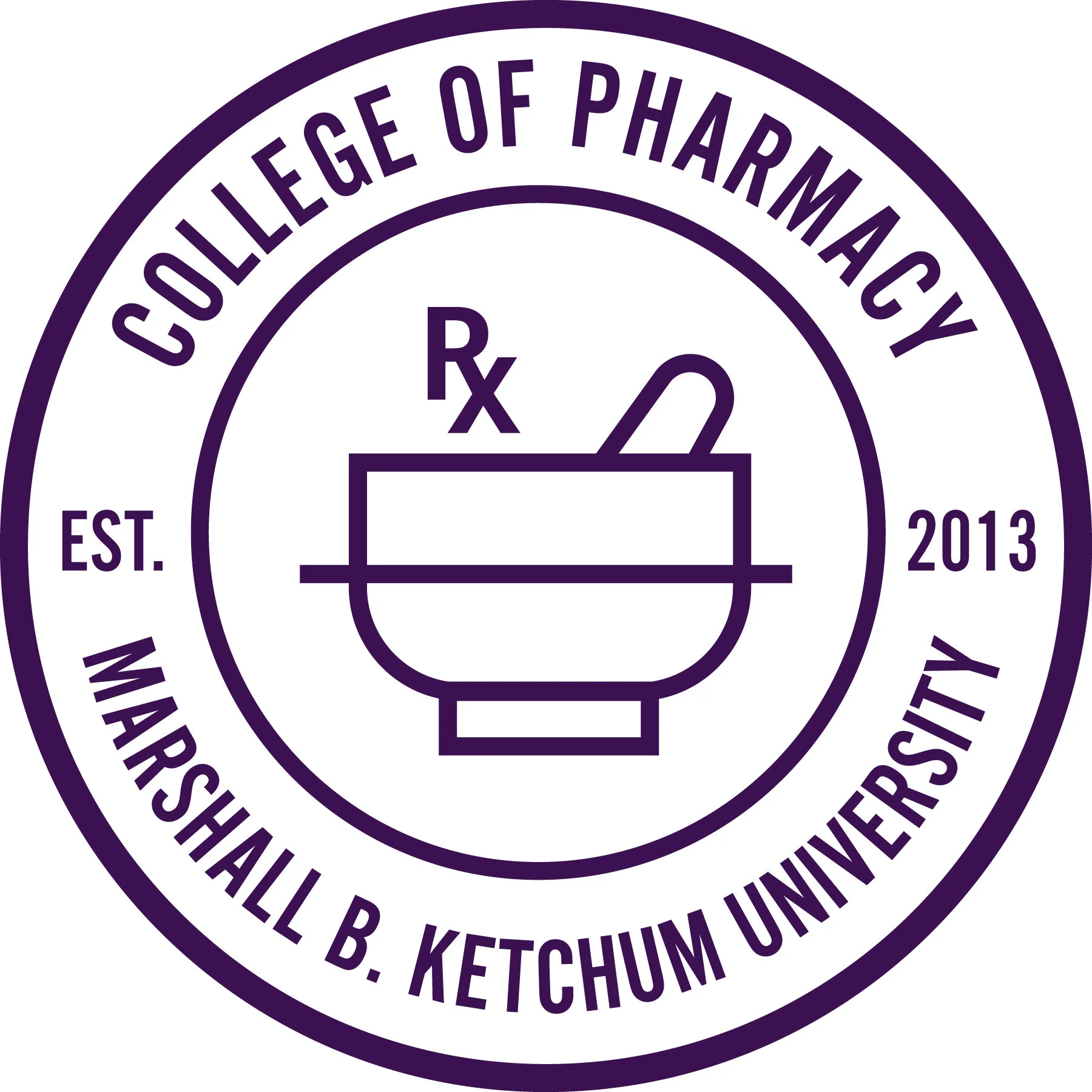
Marshall B. Ketchum University (MBKU) officially became a university in 2013 after branching off from the Southern California College of Optometry, an optometry college since 1904 and established programs within PA studies (2011) and pharmacy (2013).
My Approach
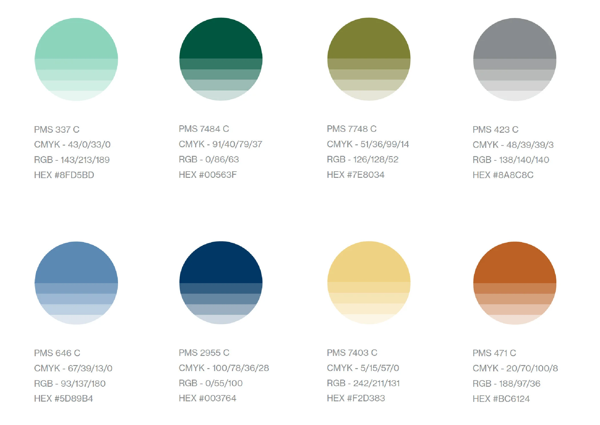
The goal of the redesign was to embolden the University’s namesake, Marshall B. Ketchum, and to define each program neatly within the University logo mark. The project encompassed all branches of the MBKU brand identity, from its color palette, imagery style, and more. The intention was to breathe new life into the brand as well as to present a cohesive and professional outlook for the University. Another important aspect of the redesign was to educate the organization about proper brand usage, the importance of maintaining brand integrity and extending support to sustain successful implementation of the new brand assets.